Data Visualization
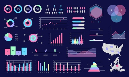
Data visualization (also called information visualization or statistical visualization) is defined as the design, development, and application of computer-generated graphical representation of data[1]. Today, computers can be used to process and display large amounts of data in a way that is efficient, easily accessible, and understandable. The human mind is visual by nature. As a result, visualization is found everywhere: ranging from lines and points on a graph to the standardized symbols called emojis. Whether the underlying information encompasses strict quantitative data or an individual's wish to convey a certain emotion, data visualization is, on a basic level, a method of communicating information and ideas[2].
As the amount of data accumulated due to the rise of the Internet increasingly outsizes what existed before, the need to wrangle, process, and analyze this information has increased as well. Large industries and organizations particularly value the tools used to represent data because they enable decision makers to comprehend information and form an opinion in an efficient, profitable manner[3]. Scientists must choose how they want to represent their data, as well as consider the audience they intend to show it to because data visualization influences how people make sense of the information before them[4]. The processes and decisions which go into creating these representations have caused ethical concerns to arise regarding fairness, bias, and accountability.
Contents
History
The first visual representation of statistical data is believed to have been provided by Flemish astronomer Michael Florent van Langren in 1644. In a line graph which records the twelve known estimates at the time of the difference in longitude between Rome and Toledo as well as the name of each astronomer who provided the estimate, van Langren's visualization was notable for its visual portrayal of the wide variations in estimates[5]. In the 18th century, thematic mapping originated in an attempt to catalogue geologic, economic, and medical data, which introduced abstract graphs of functions, measurement error, and collection of empirical data.
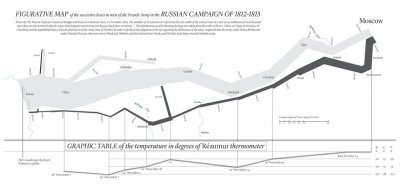
The latter half of the 19th century is what Canadian psychologist Michael Friendly refers to as the "Golden Age of statistical graphics"[6]. This time period hosts famous examples of data visualization, including John Snow's map of cholera outbreaks in the London epidemic of 1854, Charles Minard's 1869 chart showing the number of men in Napoleon's 1812 infamous Russian campaign army, and a new type of visualization called the Rose Diagram from Florence Nightingale. The Golden Age stemmed from the industrial revolution, the establishment of official government statistical offices due to rising population, and a growing recognition for the importance of numerical data in fields like social planning, medicine, military, industrialization, commerce, and transportation.
The 20th century, however, brought about the greatest progression in data visualization because of the development of computing power[7]. The late 1950s and 1960s brought about the adoption of the programming language, FORTRAN, which allowed for the the creation of statistical data processed by computers. Visualizations from history could now be rendered in increasing detail and with interactive elements, such as the redrawing of Minard's figurative map. Since then, there has been a rapid increase in technological development which allows for the pioneering of new visualization methods to be employed upon much larger scales of data.
Techniques
Data visualization is used in many different fields and areas of study to inform audiences which include scholars, policy makers, corporate figures, the general public, and more. Data scientists choose methods of visualization which best suit the given dataset and data context.
Exploratory versus Explanatory
An exploratory data visualization allows those working with large, noisy datasets to make sense of what is inside. Translating to a visual medium can bring forth dominating features otherwise hidden, such as patterns, trends, or anomalous outliers. Explorations is useful when there is a high level of granularity in the data, preventing oversimplification or excessive stripping of the dataset.
In contrast, an explanatory data visualization serves the purpose of telling the data story to an audience. This method is appropriate for when the underlying themes within the dataset are already known. The scientist decides how that data will be represented with the intention of highlighting those themes. Such visualizations may stand on their own, or be part of a larger presentation, such as a speech, newspaper article, or a report.
Exploratory data visualization is well-suited for the data analysis phase, while explanatory data representations are for the communication phase of the scientific method[8].
Informative versus Persuasive
An informative visualization aims for a neutral presentation of the facts in such a way that will educate its audience members. In this case, the audience is allowed to make their own decisions about the topic at hand, without any outside persuasion from the designer. Informative visualizations are often associated with broad data sets, and are intended to turn raw data into information that is easily digestible for the consumer[9].
Examples of informative visualization include world map-style representations, line graphs, and 3-D virtual building or town plan designs
A persuasive visualization is created with the purpose of influencing others or making a desired message more persuasive[10]. With this technique, the designer is directly communicating with the intended audience. The data presented within the visualization is hand-chosen to support the designer's point of view, and is presented carefully so as to convince others of this perspective as well.
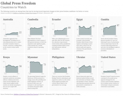
An example of persuasive visualization is Marc Soares' Global Press Freedom: Countries to Watch, which investigates the press freedom score for ten different countries and provides additional commentary about each of them. Soares provides a clear visual of countries which are most at risk, conveying his message[11].
Data art
Also known as information art or informatism, data art often entails the unidirectional encoding of information. As a result, the audience may not be able to make sense of the visual presentation to understand the underlying information. Data art translates the data into a visual form without the trying to convey its meaning to others. The designer may condense the data, translate it to a new medium, or simply make it beautiful with no intention for the audience to be able to extract anything from it other than pure enjoyment.
An example of data art is Nathalie Miebach's sculptures made from gathering data on shifting weather patterns within a 24-hour period. Further translating weather data points into a musical score to be performed by an orchestra, Miebach's data art explores the intersection science, data, musical performance, and sculpture for aesthetic purposes.
References
- ↑ “A Brief History of Data Visualization.” Accessed January 21, 2022. https://www.dundas.com/resources/blogs/introduction-to-business-intelligence/brief-history-data-visualization.
- ↑ Manuela Aparicio, Carlos J. Costa. “Data Visualization.” Communication Design Quarterly, November 2014.
- ↑ Few, Stephen. “Data Visualization - Past, Present, and Future,” n.d., 12.
- ↑ Healy, Kieran. Data Visualization: A Practical Introduction. Princeton University Press, 2018.
- ↑ “A Brief History of Data Visualization.” Accessed January 21, 2022. https://www.dundas.com/resources/blogs/introduction-to-business-intelligence/brief-history-data-visualization.
- ↑ Friendly, Michael. “The Golden Age of Statistical Graphics.” Statistical Science 23, no. 4 (November 1, 2008). https://doi.org/10.1214/08-STS268.
- ↑ The Interaction Design Foundation. “Information Visualization – A Brief 20th and 21st Century History.” Accessed January 21, 2022. https://www.interaction-design.org/literature/article/information-visualization-a-brief-20th-and-21st-century-history.
- ↑ “1. Classifications of Visualizations - Designing Data Visualizations [Book].” Accessed January 21, 2022. https://www.oreilly.com/library/view/designing-data-visualizations/9781449314774/ch01.html.
- ↑ The Interaction Design Foundation. “What Is Information Visualization?” Accessed January 21, 2022. https://www.interaction-design.org/literature/topics/information-visualization.
- ↑ Pandey, Anshul Vikram, Anjali Manivannan, Oded Nov, Margaret L. Satterthwaite, and Enrico Bertini. “The Persuasive Power of Data Visualization.” SSRN Scholarly Paper. Rochester, NY: Social Science Research Network, July 31, 2014. https://papers.ssrn.com/abstract=2474695.
- ↑ Murray, Eva. “Data Visualization And The Power Of Persuasion.” Forbes. Accessed January 21, 2022. https://www.forbes.com/sites/evamurray/2019/02/11/data-visualization-and-the-power-of-persuasion/.


