Data Visualization
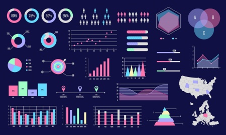
Data Visualization is defined as the design, development, and application of computer-generated graphical representation of data[1]. Today, computers can be used to process and display large amounts of data in a way that is efficient, easily accessible, and understandable. The human mind is visual by nature. As a result, visualization is found everywhere: ranging from lines and points on a graph to the standardized symbols called emojis. Whether the underlying information encompasses strict quantitative data or an individual's wish to convey a certain emotion, data visualization is, on a basic level, a method of communicating information and ideas[2].
As the amount of data accumulated due to the rise of the Internet increasingly outsizes what existed before, the need to wrangle, process, and analyze this information has increased as well. Large industries and organizations particularly value the tools used to represent data because they enable decision makers to comprehend information and form an opinion in an efficient, profitable manner[3]. Scientists must choose how they want to represent their data, as well as consider the audience they intend to show it to because data visualization influences how people make sense of the information before them[4]. The processes and decisions which go into creating these representations have caused ethical concerns to arise regarding fairness, bias, and accountability.
History
The first visual representation of statistical data is believed to have been provided by Flemish astronomer Michael Florent van Langren in 1644. In a line graph which records the twelve known estimates at the time of the difference in longitude between Rome and Toledo as well as the name of each astronomer who provided the estimate, van Langren's visualization was notable for its visual portrayal of the wide variations in estimates[5]. In the 18th century, thematic mapping originated in an attempt to catalogue geologic, economic, and medical data, which introduced abstract graphs of functions, measurement error, and collection of empirical data.
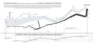
The latter half of the 19th century is what Canadian psychologist Michael Friendly refers to as the "Golden Age of statistical graphics"[6]. This time period hosts famous examples of data visualization, including John Snow's map of cholera outbreaks in the London epidemic of 1854, Charles Minard's 1869 chart showing the number of men in Napoleon's 1812 infamous Russian campaign army, and a new type of visualization called the Rose Diagram from Florence Nightingale. The Golden Age stemmed from the industrial revolution, the establishment of official government statistical offices due to rising population, and a growing recognition for the importance of numerical data in fields like social planning, medicine, military, industrialization, commerce, and transportation.
The 20th century, however, brought about the greatest progression in data visualization because of the development of computing power[7]. The late 1950s and 1960s brought about the adoption of the programming language, FORTRAN, which allowed for the the creation of statistical data processed by computers. Visualizations from history could now be rendered in increasing detail and with interactive elements, such as the redrawing of Minard's figurative map. Since then, there has been a rapid increase in technological development which allows for the pioneering of new visualization methods to be employed upon much larger scales of data.
Classifications
References
- ↑ Sadiku, Matthew, Adebowale Shadare, Sarhan Musa, Cajetan Akujuobi, and Roy Perry. “DATA VISUALIZATION.” International Journal of Engineering Research and Advanced Technology (IJERAT) 12 (December 1, 2016): 2454–6135.
- ↑ Manuela Aparicio, Carlos J. Costa. “Data Visualization.” Communication Design Quarterly, November 2014.
- ↑ Few, Stephen. “Data Visualization - Past, Present, and Future,” n.d., 12.
- ↑ Healy, Kieran. Data Visualization: A Practical Introduction. Princeton University Press, 2018.
- ↑ “A Brief History of Data Visualization.” Accessed January 21, 2022. https://www.dundas.com/resources/blogs/introduction-to-business-intelligence/brief-history-data-visualization.
- ↑ Friendly, Michael. “The Golden Age of Statistical Graphics.” Statistical Science 23, no. 4 (November 1, 2008). https://doi.org/10.1214/08-STS268.
- ↑ The Interaction Design Foundation. “Information Visualization – A Brief 20th and 21st Century History.” Accessed January 21, 2022. https://www.interaction-design.org/literature/article/information-visualization-a-brief-20th-and-21st-century-history.

