Difference between revisions of "Data Visualization"
| Line 79: | Line 79: | ||
</ref>. | </ref>. | ||
| + | [[File:miebach.jpeg|150px|thumb|left|One of Miebach's weather pattern sculptures]] | ||
==== Data Art ==== | ==== Data Art ==== | ||
| − | |||
Also known as information art or informatism, [https://en.wikipedia.org/wiki/Information_art data art] often entails the unidirectional encoding of information. As a result, the audience may not be able to make sense of the visual presentation to understand the underlying information. Data art translates the data into a visual form without the trying to convey its meaning to others. The designer may condense the data, translate it to a new medium, or simply make it beautiful with no intention for the audience to be able to extract anything from it other than pure enjoyment. | Also known as information art or informatism, [https://en.wikipedia.org/wiki/Information_art data art] often entails the unidirectional encoding of information. As a result, the audience may not be able to make sense of the visual presentation to understand the underlying information. Data art translates the data into a visual form without the trying to convey its meaning to others. The designer may condense the data, translate it to a new medium, or simply make it beautiful with no intention for the audience to be able to extract anything from it other than pure enjoyment. | ||
| Line 117: | Line 117: | ||
</ref>. Onuoha's project is one of many created to combat the ethical dilemmas surrounding data visualization. | </ref>. Onuoha's project is one of many created to combat the ethical dilemmas surrounding data visualization. | ||
| + | [[File:femicide-map.png|400px|thumb|left|María Salguero's femicide map]] | ||
====== Femicides in Mexico ====== | ====== Femicides in Mexico ====== | ||
| − | In the mid-1990s, Cuidad Juárez, Mexico became known for its gruesome killings of women. These deliberate gender-based killings are known as [https://en.wikipedia.org/wiki/Femicide | + | In the mid-1990s, Cuidad Juárez, Mexico became known for its gruesome killings of women. These deliberate gender-based killings are known as [https://en.wikipedia.org/wiki/Femicide femicide]. In 2019, the Mexican government registered 1006 victims of femicide across the country, but there were countless more cases where crimes went unpunished, undiscovered, or unsolved. Mothers whose daughters have been missing do not receive help from officials and are left to do the work of searching for their loved ones alone. In November 2001, eight young women were found in an abandoned cotton field near the [https://en.wikipedia.org/wiki/Maquiladora maquiladora] association headquarters. The following year, a group of mothers presented a petition against the state of Mexico to the Inter-American Court of Human Rights. The state announced that their daughters' killings were isolated crimes. In 2009, the Inter-American Court ruled that Mexico mishandled the investigations. However, this did little for those still suffering from the intersection of unjust cultural, social, and economic systems<ref>The Seattle Times. “Disappearing Daughters | Mothers Search for Justice and Embrace Fragile Memories.” Accessed January 23, 2022. https://projects.seattletimes.com/2020/femicide-juarez-mexico-border/. |
</ref>. One woman in particular, [https://es.wikipedia.org/wiki/Mar%C3%ADa_Salguero_Ba%C3%B1uelos María Salguero], took matters into her own hands to fill the gaps left by offical data. As a human rights activist and geophysical engineer, Salguero created a [https://feminicidiosmx.crowdmap.com/ map tracking cases of femicide]. Detailing the names of victimes, their ages, how they were murdered and by whom, and more, she has mapped over 6000 cases of femicide dating back to 2011. Salguero's work directly highlights the data Mexican officials failed to collect<ref>openDemocracy. “How One Woman Is Mapping Femicides in Mexico.” Accessed January 23, 2022. https://www.opendemocracy.net/en/5050/how-one-woman-is-mapping-femicides-in-mexico/. | </ref>. One woman in particular, [https://es.wikipedia.org/wiki/Mar%C3%ADa_Salguero_Ba%C3%B1uelos María Salguero], took matters into her own hands to fill the gaps left by offical data. As a human rights activist and geophysical engineer, Salguero created a [https://feminicidiosmx.crowdmap.com/ map tracking cases of femicide]. Detailing the names of victimes, their ages, how they were murdered and by whom, and more, she has mapped over 6000 cases of femicide dating back to 2011. Salguero's work directly highlights the data Mexican officials failed to collect<ref>openDemocracy. “How One Woman Is Mapping Femicides in Mexico.” Accessed January 23, 2022. https://www.opendemocracy.net/en/5050/how-one-woman-is-mapping-femicides-in-mexico/. | ||
</ref>. | </ref>. | ||
====== A Sort of Joy ====== | ====== A Sort of Joy ====== | ||
| + | [https://www.moma.org/calendar/events/1005 A Sort of Joy: Thousands of Exhausted Things] is a data performance consisting of a dialogue and collection of scenes put together using lists of data about art objects held by the [https://en.wikipedia.org/wiki/Museum_of_Modern_Art Museum of Modern Art] in New York City. Through showcasing inequalities within the art field in a public space while adding a layer of expressiveness through the choices, narration, and bodily gestures of the performers, this performance focuses on the mixture of immersive elements to convey a data story. The designers ask the audience to call upon sound through hearing the actors' delivery of lines, sight through watching the performance take place in a provocative space, as well as the usage of contextual elements, like time passing, to cultivate an aural experience for which the audience is forced to recognize their own perspective as it meshes with the artists’<ref>Loukissas, Yannis. “MODELS OF LOCAL PRACTICE,” April 30, 2019. https://doi.org/10.7551/mitpress/11543.003.0010. | ||
| + | </ref>. The creator of this performance, [https://en.wikipedia.org/wiki/Jer_Thorp Jer Thorp], aims to showcase the meaning that can be brought to data visualization when designers work to elicit a visceral reaction out of their audience members. By turning a data representation into a full-body experience that interacts with the five senses, visualization becomes more personal and impactful<ref>D’Ignazio, Catherine, and Lauren Klein. “Chapter Three: ‘What Gets Counted Counts.’” In Data Feminism, 2018. https://mitpressonpubpub.mitpress.mit.edu/pub/rykaknh1/release/4. | ||
| + | </ref>. | ||
| + | [[File:secret-garden.jpeg|200px|thumb|right|Secret Garden exhibit from On Love & Data]] | ||
====== On Love & Data ====== | ====== On Love & Data ====== | ||
| − | Data artist [https://www.stephaniedinkins.com/about.html Stephanie Dinkins’] [https://stamps.umich.edu/events/stephanie-dinkins-on-love-data On Love & Data] exhibit at the [https://stamps.umich.edu/stamps-gallery University of Michigan STAMPS gallery] shares how artificial intelligence intersects race, gender, and future histories. One piece in particular, Secret Garden, is an immersive space where the more intently the audience listens, the more is revealed | + | Data artist [https://www.stephaniedinkins.com/about.html Stephanie Dinkins’] [https://stamps.umich.edu/events/stephanie-dinkins-on-love-data On Love & Data] exhibit at the [https://stamps.umich.edu/stamps-gallery University of Michigan STAMPS gallery] shares how artificial intelligence intersects race, gender, and future histories. One piece in particular, Secret Garden, is an immersive space where the more intently the audience listens, the more information is revealed. As an individual steps into the space and moves around, an indistinctive collection of voices from multiple generations of Black women can be heard. If the audience pauses, one voice at a time is given the spotlight, and it is soon discovered that these women are telling their own histories. Dinkins' work urges designers of counterdata visualizations to create representations that are expressive and transparent about being personal because, once it is acknowledged that data is inherently biased, those biases can be repurposed in meaningful ways which lead to a care-encoded, ethical digital landscape<ref>Stamps School of Art & Design. “Stephanie Dinkins: On Love & Data.” Accessed January 22, 2022. https://stamps.umich.edu/events/stephanie-dinkins-on-love-data. |
</ref>. | </ref>. | ||
Revision as of 17:05, 23 January 2022
Data visualization (also called information visualization or statistical visualization) is defined as the design, development, and application of computer-generated graphical representation of data[1]. Today, computers can be used to process and display large amounts of data in a way that is efficient, easily accessible, and understandable. The human mind is visual by nature. As a result, visualization is found everywhere: ranging from lines and points on a graph to the standardized symbols called emojis. Whether the underlying information encompasses strict quantitative data or an individual's wish to convey a certain emotion, data visualization is, on a basic level, a method of communicating information and ideas[2].
As the amount of data accumulated due to the rise of the Internet increasingly outsizes what existed before, the need to wrangle, process, and analyze this information has increased as well. Large industries and organizations particularly value the tools used to represent data because they enable decision makers to comprehend information and form an opinion in an efficient, profitable manner[3]. Scientists must choose how they want to represent their data, as well as consider the audience they intend to show it to because data visualization influences how people make sense of the information before them[4]. The processes and decisions which go into creating these representations have caused ethical concerns to arise regarding fairness, bias, and integrity.
History
The first visual representation of statistical data is believed to have been provided by Flemish astronomer Michael Florent van Langren in 1644. In a line graph which records the twelve known estimates at the time of the difference in longitude between Rome and Toledo as well as the name of each astronomer who provided the estimate, van Langren's visualization was notable for its visual portrayal of the wide variations in estimates[5]. In the 18th century, thematic mapping originated in an attempt to catalogue geologic, economic, and medical data, which introduced abstract graphs of functions, measurement error, and collection of empirical data.
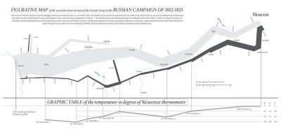
The latter half of the 19th century is what Canadian psychologist Michael Friendly refers to as the "Golden Age of statistical graphics"[6]. This time period hosts famous examples of data visualization, including John Snow's map of cholera outbreaks in the London epidemic of 1854, Charles Minard's 1869 chart showing the number of men in Napoleon's 1812 infamous Russian campaign army, and a new type of visualization called the Rose Diagram from Florence Nightingale. The Golden Age stemmed from the industrial revolution, the establishment of official government statistical offices due to rising population, and a growing recognition for the importance of numerical data in fields like social planning, medicine, military, industrialization, commerce, and transportation.
The 20th century, however, brought about the greatest progression in data visualization because of the development of computing power[7]. The late 1950s and 1960s brought about the adoption of the programming language, FORTRAN, which allowed for the the creation of statistical data processed by computers. Visualizations from history could now be rendered in increasing detail and with interactive elements, such as the redrawing of Minard's figurative map. Since then, there has been a rapid increase in technological development which allows for the pioneering of new visualization methods to be employed upon much larger scales of data.
Terminology
As data visualization's emergence comes from the intersection of fields like data science, statistics, and information, it consists of specific terminology. It is important to recognize the kind of data that a visualization is representing, as different types of data call for different representation.
Categorical vs. Quantitative
Categorial data (also referred to as qualitative data) are descriptive information about characteristics which are difficult to define or measure, or cannot be expressed numerically[8]. Objects are grouped together based upon similarities defined by the scientist. Categories themselves can either be nominal, meaning they have no order, or ordinal, meaning there is order between them. Examples of nominal categorical data include gender, flavor, and texture. A well-known example of ordinal categorical data is the Likert scale.
Quantitative data are measures of values or counts that can be expressed numerically[9]. These values can either be discrete or continuous. Discrete variables take on a finite number of possibilities, while continuous variables take on an infinite number of values on a continuous scale. Examples of discrete quantitative data include word count or population. Examples of continuous quantitative data include temperature or weight.
Infographics
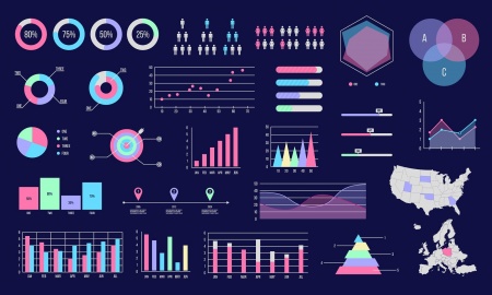
Once a scientist is able to recognize which kind of data they are working with, the type of visualization which best portrays the information may vary. The designer must choose between a variety of infographic types.
Statistical
Statistical graphics show trends on distributions of numbers. These include diagrams, charts, graphs, tables, and lists[10].
Cartograms
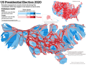
Cartograms are maps which distort reality to convey information. They resize, exaggerate, and emphasize certain variables in a proportionate manner. Types of cartograms include density-equalizing, in which areas bulge out in accordance to the featured variable, non-contiguous, in which the objects can move around freely, and Dorling, in which the objects are represented as shapes to bring forth easily recognizable patterns[11].
Time Series
A time series is a collection of observations obtained through repeated measurements across a specific timeline[12]. These are often used by companies to collect data on revenue and profit because individual values matter less than relative changes. Designers can choose to represent a time series through stacked graphs, horizon graphs, index charts, or small multiples.
Hierarchies
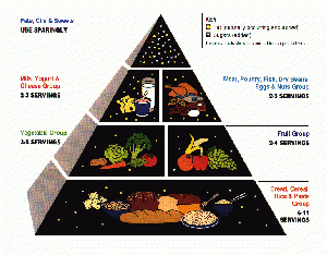
Hierarchal visualizations show natural hierarchies within variable categories. For example, the food pyramid is the most common hierarchal infographic, in which levels of the pyramid directly correspond to how often each kind of food should be incorporated into the human diet.
Networks
Network infographics display relationships between elements. These are often used when investigating social connections between people, like friendships or familial relationships. The most common type of network visualization is a force-directed layout, where nodes are connected by links and often repel each other when not related[13].
While these visualizations can be effective on their own, there are many modern infographics which combine multiple types into one. These graphics may also include supplemental features, like text or illustrations[14].
Techniques
Data visualization is used in many different fields and areas of study to inform audiences which include scholars, policy makers, corporate figures, the general public, and more. Data scientists choose methods of visualization which best suit the given dataset and data context.
Exploratory vs. Explanatory
An exploratory data visualization allows those working with large, noisy datasets to make sense of what is inside. Translating to a visual medium can bring forth dominating features otherwise hidden, such as patterns, trends, or anomalous outliers. Explorations is useful when there is a high level of granularity in the data, preventing oversimplification or excessive stripping of the dataset.
In contrast, an explanatory data visualization serves the purpose of telling the data story to an audience. This method is appropriate for when the underlying themes within the dataset are already known. The scientist decides how that data will be represented with the intention of highlighting those themes. Such visualizations may stand on their own, or be part of a larger presentation, such as a speech, newspaper article, or a report.
Exploratory data visualization is well-suited for the data analysis phase, while explanatory data representations are for the communication phase of the scientific method[15].
Informative vs. Persuasive
An informative visualization aims for a neutral presentation of the facts in such a way that will educate its audience members. In this case, the audience is allowed to make their own decisions about the topic at hand, without any outside persuasion from the designer. Informative visualizations are often associated with broad data sets, and are intended to turn raw data into information that is easily digestible for the consumer[16].
Examples of informative visualization include world map-style representations, line graphs, and 3-D virtual building or town plan designs
A persuasive visualization is created with the purpose of influencing others or making a desired message more persuasive[17]. With this technique, the designer is directly communicating with the intended audience. The data presented within the visualization is hand-chosen to support the designer's point of view, and is presented carefully so as to convince others of this perspective as well.
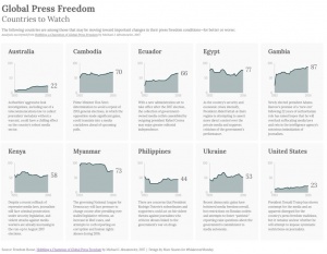
An example of persuasive visualization is Marc Soares' Global Press Freedom: Countries to Watch, which investigates the press freedom score for ten different countries and provides additional commentary about each of them. Soares provides a clear visual of countries which are most at risk, conveying his message[18].
Data Art
Also known as information art or informatism, data art often entails the unidirectional encoding of information. As a result, the audience may not be able to make sense of the visual presentation to understand the underlying information. Data art translates the data into a visual form without the trying to convey its meaning to others. The designer may condense the data, translate it to a new medium, or simply make it beautiful with no intention for the audience to be able to extract anything from it other than pure enjoyment.
An example of data art is Nathalie Miebach's sculptures made from gathering data on shifting weather patterns within a 24-hour period. Further translating weather data points into a musical score to be performed by an orchestra, Miebach's data art explores the intersection science, data, musical performance, and sculpture for aesthetic purposes[19].
Ethical Dilemmas
Because data visualization is grounded in individual perspective and interpretation of the designer as well as the audience, the ethics behind these processes have been brought into question regarding fairness, bias, and accountability.
Bias
Behind each visual representation, there is a person or a group of people who have made each decision from the dataset's conceptualization to the details of the final visualization. As a result, bias can be inherited, whether intentionally or unintentionally, and alter a visualization's overall influence upon others.
Colonization
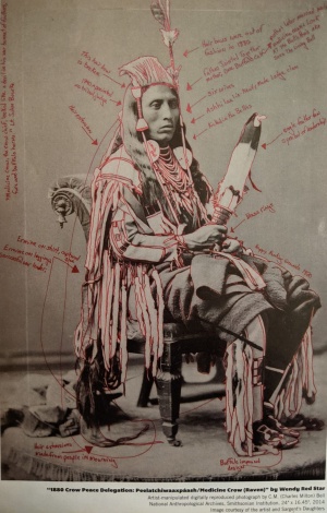
The history of data visualization is written by those in the majority. In the active choices made about what data to collect, present, and how to present it, these designers decide whose stories will and will not be remembered. The roots of data visualization are most commonly traced back to mid-seventeenth century Europe. In reality, it has extended far beyond this timeline[20]. As early as 1500 CE, the Incans used khipus, knotted cords, to record census data including clan, social rank, and tax payment. A photo of Peelatchiwaaxpáash reveals data relating to wars that took place in the 1800s encoded in his hair and regalia[21]. Because data science is built upon hierarchal systems of power, data activists are encouraging people to turn their attention to universities, corporations, monopolies, and governments to hold those in power accountable for abolishing the biases within data fields[22].
The God Trick
Most of the visualizations that are seen on a day-to-day basis are statistical infographics presented as neutral modes of sharing facts. Charts and diagrams with clean, minimalistic appearances have been generally accepted as non-biased. This is due to what philosopher Donna Haraway coined as "the god trick" in the 1980s[23]. The view from nowhere (from a distance, from up above, like a god) may be data visualization's most prominent feature. This method attempts to mask the people, the methods, and the questions that lie within the dataset. The approach has been contested due to several cases confirming that, despite its intentions, there is still some perspective incorporated within what the designer decides to show and what not to show. These perspectives also tend to favor the dominant group's perspective[24]. Because all data are local in terms of situational and geographical context, meaning that data are not universal nor singular, "the god trick" has been rendered a failed method of eliminating bias from data visualization[25].
Language
The phrase "raw data" is ubiquitous in the data science world. It is used to refer to data before it is processed and manipulated. The idea that the numbers haven't yet been tampered with by a person or people alludes to the understanding that data, at its purest form, remains neutral. The appeal for this phrase leads to the growing belief that data technology is autonomous and objective. Other words often associated with data such as "collected", "entered", "mined", "stored", and "interpreted" contribute to this perspective as well. This can have a dangerous effect because it allows for those behind data visualizations to avoid accountability. Instead, they can push blame onto the numbers themselves, or the technologies which are being used[26].
Literacy
Data literacy is the ability to read, understand, create, and communicate data as information. To be data literate is to have the capability to craft coherent and effective data representations. However, the teams creating data visualizations are rarely diverse, nor do they look like those who are most affected by their implications[27]. As a result, the demographics of the data science field do not accurately represent the population as a whole. Due to the intersection of concepts like the matrix of domination and the digital divide, the systemic issues which typically bar minoritized groups from reaching levels of authority explain why there is such a large gap regarding data literacy. Researchers in the data science field, Catherine D'Ignazio and Rahul Bhargava collaborated with a community group called Groundwork Somerville to combat this issue. They worked together to identify data, find a story, and design a visual to tell that story in the form of a mural before hosting an unveiling event. The demographics of the team consisted of six young women of color, seven young men of color, two young white women, and two young white men. The youth were able to sketch visuals of what the mural should look like without a data-oriented background as well as gain an understanding of the data visualization process[28].
Counterdata
Counterdata (also called agonistic data collection, data activism, statactivism, and citizen science) is an activist response to the biases found within the data visualization and science fields. Spots that are left blank are to be filled in by those who face the effects of unjust systems of power. Visual artist Mimi Onuoha highlights the value of missing data that should exist through the Library of Missing Datasets. This piece consists of rows of filing cabinets filled with folders, each labeled with datasets such as LGBTQ+ older adults discriminated against in housing, undocumented immigrants currently incarcerated and/or underpaid, and how often police arrest women for making false rape reports. However, when opened, these folders are empty, reflecting their absence in the data world[29]. Onuoha's project is one of many created to combat the ethical dilemmas surrounding data visualization.
Femicides in Mexico
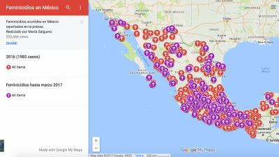
In the mid-1990s, Cuidad Juárez, Mexico became known for its gruesome killings of women. These deliberate gender-based killings are known as femicide. In 2019, the Mexican government registered 1006 victims of femicide across the country, but there were countless more cases where crimes went unpunished, undiscovered, or unsolved. Mothers whose daughters have been missing do not receive help from officials and are left to do the work of searching for their loved ones alone. In November 2001, eight young women were found in an abandoned cotton field near the maquiladora association headquarters. The following year, a group of mothers presented a petition against the state of Mexico to the Inter-American Court of Human Rights. The state announced that their daughters' killings were isolated crimes. In 2009, the Inter-American Court ruled that Mexico mishandled the investigations. However, this did little for those still suffering from the intersection of unjust cultural, social, and economic systems[30]. One woman in particular, María Salguero, took matters into her own hands to fill the gaps left by offical data. As a human rights activist and geophysical engineer, Salguero created a map tracking cases of femicide. Detailing the names of victimes, their ages, how they were murdered and by whom, and more, she has mapped over 6000 cases of femicide dating back to 2011. Salguero's work directly highlights the data Mexican officials failed to collect[31].
A Sort of Joy
A Sort of Joy: Thousands of Exhausted Things is a data performance consisting of a dialogue and collection of scenes put together using lists of data about art objects held by the Museum of Modern Art in New York City. Through showcasing inequalities within the art field in a public space while adding a layer of expressiveness through the choices, narration, and bodily gestures of the performers, this performance focuses on the mixture of immersive elements to convey a data story. The designers ask the audience to call upon sound through hearing the actors' delivery of lines, sight through watching the performance take place in a provocative space, as well as the usage of contextual elements, like time passing, to cultivate an aural experience for which the audience is forced to recognize their own perspective as it meshes with the artists’[32]. The creator of this performance, Jer Thorp, aims to showcase the meaning that can be brought to data visualization when designers work to elicit a visceral reaction out of their audience members. By turning a data representation into a full-body experience that interacts with the five senses, visualization becomes more personal and impactful[33].
On Love & Data
Data artist Stephanie Dinkins’ On Love & Data exhibit at the University of Michigan STAMPS gallery shares how artificial intelligence intersects race, gender, and future histories. One piece in particular, Secret Garden, is an immersive space where the more intently the audience listens, the more information is revealed. As an individual steps into the space and moves around, an indistinctive collection of voices from multiple generations of Black women can be heard. If the audience pauses, one voice at a time is given the spotlight, and it is soon discovered that these women are telling their own histories. Dinkins' work urges designers of counterdata visualizations to create representations that are expressive and transparent about being personal because, once it is acknowledged that data is inherently biased, those biases can be repurposed in meaningful ways which lead to a care-encoded, ethical digital landscape[34].
References
- ↑ “A Brief History of Data Visualization.” Accessed January 21, 2022. https://www.dundas.com/resources/blogs/introduction-to-business-intelligence/brief-history-data-visualization.
- ↑ Manuela Aparicio, Carlos J. Costa. “Data Visualization.” Communication Design Quarterly, November 2014.
- ↑ Few, Stephen. “Data Visualization - Past, Present, and Future,” n.d., 12.
- ↑ Healy, Kieran. Data Visualization: A Practical Introduction. Princeton University Press, 2018.
- ↑ “A Brief History of Data Visualization.” Accessed January 21, 2022. https://www.dundas.com/resources/blogs/introduction-to-business-intelligence/brief-history-data-visualization.
- ↑ Friendly, Michael. “The Golden Age of Statistical Graphics.” Statistical Science 23, no. 4 (November 1, 2008). https://doi.org/10.1214/08-STS268.
- ↑ The Interaction Design Foundation. “Information Visualization – A Brief 20th and 21st Century History.” Accessed January 21, 2022. https://www.interaction-design.org/literature/article/information-visualization-a-brief-20th-and-21st-century-history.
- ↑ Helmenstine, Anne. “Qualitative and Quantitative Data - Definitions and Examples.” Science Notes and Projects (blog), March 27, 2017. https://sciencenotes.org/qualitative-quantitative-data-definitions-examples/.
- ↑ Statistics, c=AU; o=Commonwealth of Australia; ou=Australian Bureau of. “Statistical Language - Quantitative and Qualitative Data.” c=AU; o=Commonwealth of Australia; ou=Australian Bureau of Statistics. Accessed January 22, 2022. https://www.abs.gov.au/websitedbs/D3310114.nsf/Home/Statistical+Language+-+quantitative+and+qualitative+data.
- ↑ Siricharoen, Waralak. “Infographics the New Communication Tools in Digital Age,” September 13, 2013.
- ↑ GISGeography. “Cartogram Maps: Data Visualization with Exaggeration.” GIS Geography, September 18, 2016. https://gisgeography.com/cartogram-maps/.
- ↑ Statistics, c=AU; o=Commonwealth of Australia; ou=Australian Bureau of. “Time Series Analysis: The Basics.” c=AU; o=Commonwealth of Australia; ou=Australian Bureau of Statistics. Accessed January 22, 2022. https://www.abs.gov.au/websitedbs/d3310114.nsf/home/time+series+analysis:+the+basics.
- ↑ Kobourov, Stephen G. “Force-Directed Drawing Algorithms.” . . FORCE, n.d., 26.
- ↑ Van Slembrouck, Paul. “Analyzing the Top 30 Infographics on Visually,” May 15, 2012. https://rockcontent.com/blog/top-30-viral-infographics/.
- ↑ “1. Classifications of Visualizations - Designing Data Visualizations [Book].” Accessed January 21, 2022. https://www.oreilly.com/library/view/designing-data-visualizations/9781449314774/ch01.html.
- ↑ The Interaction Design Foundation. “What Is Information Visualization?” Accessed January 21, 2022. https://www.interaction-design.org/literature/topics/information-visualization.
- ↑ Pandey, Anshul Vikram, Anjali Manivannan, Oded Nov, Margaret L. Satterthwaite, and Enrico Bertini. “The Persuasive Power of Data Visualization.” SSRN Scholarly Paper. Rochester, NY: Social Science Research Network, July 31, 2014. https://papers.ssrn.com/abstract=2474695.
- ↑ Murray, Eva. “Data Visualization And The Power Of Persuasion.” Forbes. Accessed January 21, 2022. https://www.forbes.com/sites/evamurray/2019/02/11/data-visualization-and-the-power-of-persuasion/.
- ↑ Nordic APIs. “6 Inspiring Examples of Data-Driven Art | Nordic APIs |,” February 17, 2020. https://nordicapis.com/6-inspiring-examples-of-data-driven-art/.
- ↑ Evergreen Data. “Decolonizing Data Viz,” January 6, 2021. https://stephanieevergreen.com/decolonizing-data-viz/.
- ↑ Aperture. “Decolonizing Photography: A Conversation With Wendy Red Star,” December 14, 2016. https://aperture.org/editorial/wendy-red-star/.
- ↑ “Notes on Fake Decolonization.” Accessed January 22, 2022. https://africasacountry.com/2020/12/notes-on-fake-decolonization.
- ↑ Haraway, Donna. “Situated Knowledges: The Science Question in Feminism and the Privilege of Partial Perspective.” Feminist Studies 14, no. 3 (1988): 575–99. https://doi.org/10.2307/3178066.
- ↑ D’Ignazio, Catherine, and Lauren Klein. “3. On Rational, Scientific, Objective Viewpoints from Mythical, Imaginary, Impossible Standpoints.” In Data Feminism, 2020. https://data-feminism.mitpress.mit.edu/pub/5evfe9yd/release/2.
- ↑ Loukissas, Yanni Alexander. All Data Are Local: Thinking Critically in a Data-Driven Society. MIT Press, 2019.
- ↑ Gitelman, Lisa. Raw Data Is an Oxymoron. MIT Press, 2013.
- ↑ “1. The Power Chapter · Data Feminism.” Accessed January 22, 2022. https://data-feminism.mitpress.mit.edu/pub/vi8obxh7/release/4.
- ↑ Engebretsen, Martin, and Helen Kennedy, eds. Data Visualization in Society. NL Amsterdam: Amsterdam University Press, 2020. https://doi.org/10.5117/9789463722902.
- ↑ mimimimimi. On Missing Data Sets, 2022. https://github.com/MimiOnuoha/missing-datasets.
- ↑ The Seattle Times. “Disappearing Daughters | Mothers Search for Justice and Embrace Fragile Memories.” Accessed January 23, 2022. https://projects.seattletimes.com/2020/femicide-juarez-mexico-border/.
- ↑ openDemocracy. “How One Woman Is Mapping Femicides in Mexico.” Accessed January 23, 2022. https://www.opendemocracy.net/en/5050/how-one-woman-is-mapping-femicides-in-mexico/.
- ↑ Loukissas, Yannis. “MODELS OF LOCAL PRACTICE,” April 30, 2019. https://doi.org/10.7551/mitpress/11543.003.0010.
- ↑ D’Ignazio, Catherine, and Lauren Klein. “Chapter Three: ‘What Gets Counted Counts.’” In Data Feminism, 2018. https://mitpressonpubpub.mitpress.mit.edu/pub/rykaknh1/release/4.
- ↑ Stamps School of Art & Design. “Stephanie Dinkins: On Love & Data.” Accessed January 22, 2022. https://stamps.umich.edu/events/stephanie-dinkins-on-love-data.
